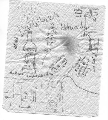
"Hugh,I think you are on the right track. The existing bottle/label design looks like every other bottle of wine (and if you didn't tell me the picture was Stormhoek, I couldn't tell from the linked pictures because the type was too small to see).
My recommendations (for what they are worth) are:
- Larger Stormhoek name on the label. The great part about the name is that it has two parts, Storm and hoek so the visual could actually wrap around the bottle and people could identify it by glimpsing only part of the name.
- Stormhoek is a WIRED brand. I would suggest a recessed part of the label area with actual (shiny) metal wires and dots (sort of like Hugh's art doodles). This would stand out in a wine shop and represent the electronic heritage of the brand. Alternatively, a flexible PCB could be wrapped around the middle of the bottle (and ideally it would be FUNCTIONAL... lighting LED's? Tracking shelf life?).
- There are a couple more bottle ideas that could be pursued... emphasis on the "Hook" with a bottle that can be hung in it's own unique "rack". This would serve two purposes... it would be a unique feature and it would also encourage consumers to DISPLAY their bottles in unique places. The other bottle idea is related to Brock's cork idea...a light in the top of the bottle which, when twisted to "on" position, would project on the ceiling of the shop. It could also be a great way to find your way home in the dark of night with your bottle of Stormhoek!
What do you think?
Dave Wheeler
Nov.10, 2005

Stormhoek Idea Napkin

No comments:
Post a Comment